
PRODUCTS
SI BUSINESS
MARKET
SUPPORT
KOLAS
ABOUT US
PR CENTER
CONTACT


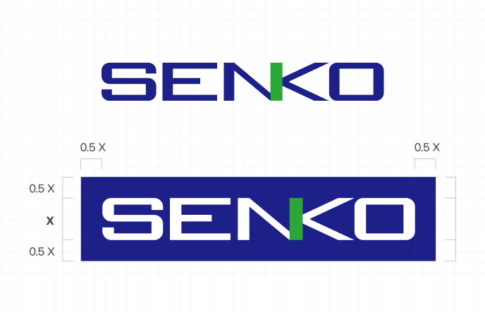
Senko's logo mark is the most basic element of our corporate identity and is an important communication tool.
Clear space is the area that is required around the outside of our logo. It must be kept free of other graphic elements such as headlines, text, images and the outside edge of materials. The minimum required clear space for the logo is defined by the measurement “X” as shown. This measurement is equal to the height of the letter S in the word mark.

It is essential that our use of color be consistent across all applications. By referring to these guidelines, we will achieve the desired results for our brand, and we’ll work more efficiently by eliminating guesswork. We have identified precise Senko Blue specifications for CMYK, RGB and solid ink. The following color table lists the values that should always be used when rendering our principle color palette. Never use tints or gradients of any color in the principle or supporting palette.
It is essential that our use of color be consistent across all applications. By referring to these guidelines, we will achieve the desired results for our brand, and we’ll work more efficiently by eliminating guesswork. We have identified precise Senko Blue specifications for CMYK, RGB and solid ink. The following color table lists the values that should always be used when rendering our principle color palette. Never use tints or gradients of any color in the principle or supporting palette.
RGB : R29 G32 B136 / CMYK : C100 M100 Y0 K0
RGB : R0 G167 B60 / CMYK : C80 M0 Y100 K0
RGB : R170 G170 B170 / CMYK : C15 M9 Y8 K22
RGB : R68 G68 B68 / CMYK : C48 M36 Y24 K66
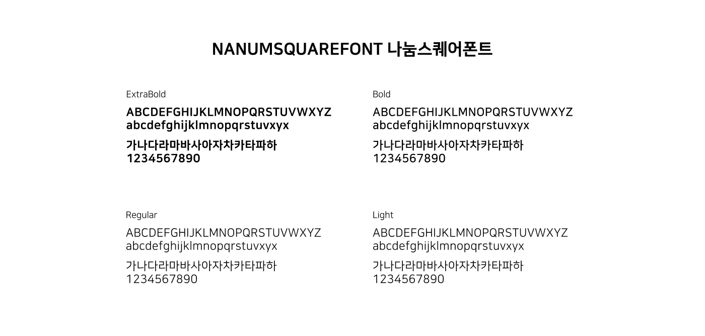
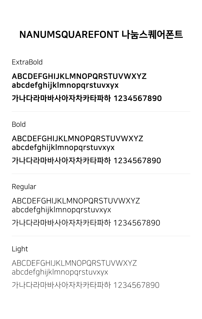
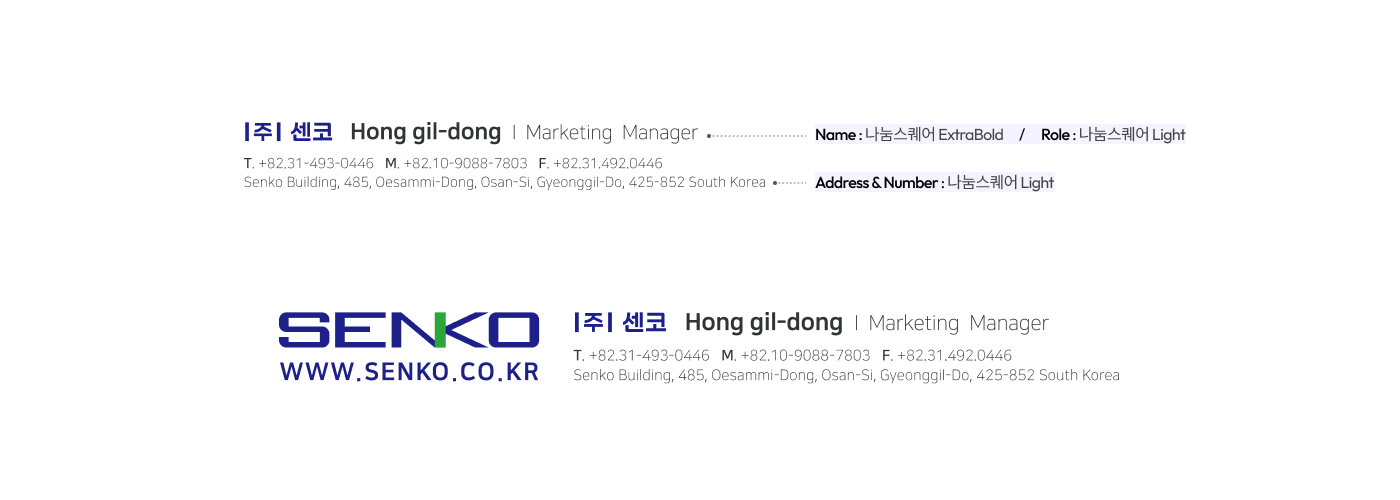
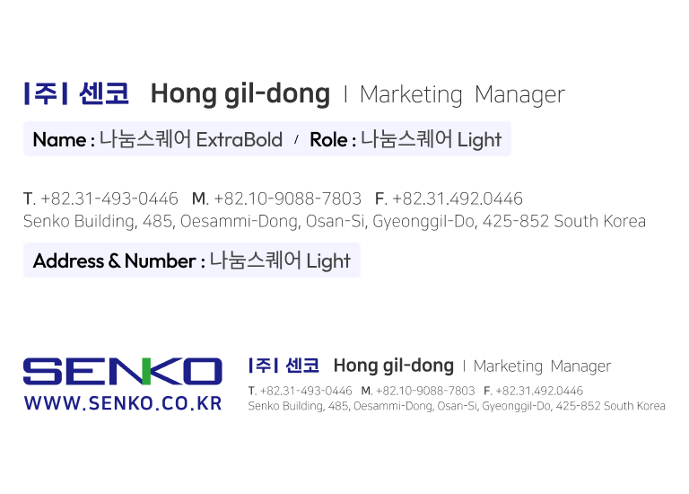
enko brand typeface, 나눔스퀘어 for Senko, is available in four fonts weights for maximum flexibility across applications. 나눔스퀘어ExrtaBold or 나눔스퀘어Bold for Senko should be used primarily for headlines, while 나눔스퀘어Regular and 나눔스퀘어Light for Senko should be used for supporting text such as body copy.
